- Home
- Photo Basics
- Accessories
- Histogram-in-photography
Understanding A Histogram in Photography: Your Comprehensive Guide to Perfect Exposure
If you've ever checked your images later and found blown-out skies or murky shadows, understanding the histogram in photography is what turns that guesswork into control.
Instead of relying on an untrustworthy camera screen in bright sunlight, this simple graph gives you an objective readout of all the tones in your scene.
Once you know how to read it, the histogram becomes a built-in exposure safety net, helping you protect both detail in the highlights and texture in the shadows.
In this guide, you’ll quickly learn how it works in the field and during editing so you can start creating confidently exposed images, consistently.
What is a Histogram in Photography?
A histogram in photography is like a heart monitor for your image’s exposure, showing at a glance how brightness values are distributed from deep shadows to bright highlights.
By learning to read this simple graph, you can judge exposure with precision in difficult light and make smarter decisions later when you edit.
Instead of guessing, you gain an objective guide that supports both technical control and creative choices.
Interpreting the Histogram - Reading the Graph
Reading a histogram can feel intimidating at first, but it’s simply a logical map of your image’s brightness.
The horizontal axis shows where tones fall, the vertical axis shows how many pixels sit at each brightness, and together they sketch the image’s overall mood—dark and low key, bright and high key, or mostly midtones.
Sharp spikes pressed against either edge are the danger zones, warning you when shadows or highlights are being clipped and detail is lost.
Once you understand these parts, you can glance at the graph and judge exposure in seconds, guided by both the scene and your creative intent.
It's crucial to remember (as we'll discuss more) that there isn't one 'ideal' histogram shape; it depends entirely on the scene's tones and your creative intent.
However, understanding these components allows you to accurately interpret what the graph is telling you about your exposure.
 on the X-axis, with Clipping Zones indicated at both ends") Understanding your histogram: This graph maps the brightness levels in your photo. The left side represents darks (blacks/shadows), the middle represents midtones, and the right represents brights (highlights/whites). The height shows the amount of pixels at each level. Spikes hitting the far edges are warnings of potentially clipped shadows or highlights.
Understanding your histogram: This graph maps the brightness levels in your photo. The left side represents darks (blacks/shadows), the middle represents midtones, and the right represents brights (highlights/whites). The height shows the amount of pixels at each level. Spikes hitting the far edges are warnings of potentially clipped shadows or highlights.Using the Histogram In-Camera (While Shooting)
Understanding the histogram graph is step one, but its real power comes alive when you use it as you're taking photos.
Think of it as a more accurate exposure meter than just relying on how the picture looks on your camera's LCD screen (which can be misleading, especially in bright sunlight).
It gives you objective data to help avoid critical exposure errors.
Viewing the Histogram on Your Camera
Most digital cameras offer a couple of ways to see the histogram:
- During Image Playback/Review: After you take a shot, press your camera's 'Info' or 'Display' button repeatedly while viewing the image on the LCD screen. One of the display options will usually show the photo alongside its histogram (and other shooting data). This lets you check the exposure you just captured.
- In Live View / Electronic Viewfinder (EVF): This is incredibly useful! Many mirrorless cameras, and DSLRs when using 'Live View' mode (shooting via the back screen), can display a live histogram directly overlaid on the scene before you even press the shutter. This allows you to see the potential exposure issues and make adjustments in real-time as you compose your shot.
Dig into your camera's menu system or manual!
Find the options for enabling both the playback histogram display and the live histogram display if your camera supports it.
Activating these is highly recommended.
What to Check on the In-Camera Histogram
When glancing at the histogram in the field, your primary concern should be the extreme edges of the graph:
- Check for Clipped Highlights (Right Edge): Is there a tall 'spike' pressed hard against the far right edge of the graph? This is a critical warning! It means parts of your image are 'blown out' to pure white, losing all detail (e.g., texture in white feathers, clouds in a bright sky). This lost highlight detail is usually unrecoverable, even if shooting RAW.
- Check for Clipped Shadows (Left Edge): Similarly, is there a spike slammed against the far left edge? This indicates 'blocked' or 'clipped' shadows – areas of pure black with no detail. While you often have more leeway to recover some shadow detail later (especially from RAW files), severe clipping here still means lost information.
- Assess Overall Distribution (Context is Key!): Look at the general spread. Is everything bunched to the left? The shot might be underexposed. Bunched to the right? Potentially overexposed. BUT remember: there's no single 'perfect' histogram shape. A dark subject against a dark background should have a histogram weighted to the left. A bright, high-key scene should be weighted to the right. Focus on avoiding the edge clipping first.
- Use Highlight Warnings ("Blinkies"): Most cameras have a 'Highlight Alert' feature (often called 'blinkies') that makes any completely overexposed (pure white) areas flash or blink during image review. Enable this in your camera's playback display menu! It's the perfect partner to the histogram, showing you exactly which parts of the image correspond to that spike on the far right edge.
Adjusting Exposure Based on the Histogram
Seeing a potential problem on the histogram allows you to fix it immediately:
- Highlights Clipping? Reduce Exposure! If the graph hits the right edge hard or you see 'blinkies', you need less light. Use your camera's Exposure Compensation button (`+/-`) and dial it down (e.g., -0.3, -0.7, -1.0 EV or more) until the spike pulls back from the edge. (If shooting Manual, you'd increase shutter speed, narrow the aperture, or lower ISO).
- Shadows Clipping (and Highlights OK)? Increase Exposure Carefully. If the graph is slammed left and you have plenty of room on the right (no highlight clipping), you might choose to increase exposure slightly to capture more shadow detail. Use positive Exposure Compensation (+0.3, +0.7 EV etc.) or adjust Manual settings. Crucially, watch the right side of the histogram as you do this to ensure you don't start blowing out highlights in the process! Often, it's safer to slightly underexpose and lift shadows later, especially with RAW files.
Applying Histogram Knowledge: Real-World Examples
Understanding the theory behind the histogram is one thing, but seeing how it relates to actual photographs is where it truly 'clicks'.
Let's move beyond the basic graph and dive into some practical, real-world examples from wildlife photography to see the histogram in action.
We'll examine specific scenarios under different lighting conditions – including dealing with an underexposed Bullfinch, achieving balanced lighting for a Nuthatch, interpreting histograms for intentionally bright or backlit shots, and tackling high-contrast scenes like a dark Kestrel against a bright sky.
By analyzing these photos alongside their histograms, you'll see how this tool helps diagnose exposure issues and guides adjustments either in-camera or during post-processing, bridging the gap between theory and practical application in the field.
Example 1: Underexposed Image (Left-Skewed Histogram)
This first example shows a common issue, especially in tricky light.
Notice how the histogram for this Bullfinch image is heavily pushed, or 'skewed', towards the left side, with almost no data reaching the midtones or highlights.
This immediately signals that the captured image contains mostly dark tones (blacks and shadows) and appears underexposed.
 Underexposed: This histogram confirms the original Bullfinch photo was too dark. Most pixels are clustered on the left (dark tones), and the spike hitting the edge signals lost detail in the deepest shadows.
Crucially, the tall spike hitting the far left edge indicates 'clipped' shadows – areas of pure black where texture and detail have been completely lost.
Seeing a histogram like this in-camera is a clear warning sign. It tells you to increase your exposure before taking the next shot, perhaps by using positive Exposure Compensation (like +0.7 or +1 EV) or adjusting settings in Manual mode, aiming to shift the graph data more towards the centre and right.
While getting it right in-camera is always best, if you do end up with an underexposed shot (and especially if you shot in RAW format), post-processing can often salvage it.
As shown in the final image below, using editing software to 'lift' the shadows and increase the overall exposure can recover significant detail, breathing life back into the photo – although any detail truly clipped to black will remain lost.
 The final Bullfinch image after correcting the underexposure indicated by the histogram above, revealing detail in the plumage.
Example 2: Well-Exposed Image (Even Lighting)
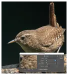
This example featuring a Nuthatch shows what a histogram often looks like for a scene with relatively even lighting and a good range of tones.
Notice in the Levels panel how the data forms a 'mountain range' primarily in the centre (midtones), tapering off gently towards the shadows (left) and highlights (right), without any significant peaks hitting the absolute black or white edges.
 A well-exposed Nuthatch photo and its corresponding histogram (shown in the Levels panel). The data is nicely spread across the tonal range without hitting the edges, indicating good detail retention.
This 'ideal' distribution (remembering there's no single perfect shape!) indicates that detail has been captured well across the dynamic range, from the darker bark to the brighter feathers.
In this specific case, slight positive exposure compensation (+1/3 stop) was added in-camera when taking the shot.
This was because the initial meter reading had slightly underexposing the Nuthatch against the neutral background; the small positive adjustment helped nudge the histogram slightly right, ensuring the midtones were perfectly placed without risking clipping the highlights.
Example 3: Intentionally Bright (High Key / Backlit)
What if your histogram shows most of the data pushed towards the right side?
While this often indicates overexposure, it's not always a mistake!
Sometimes, creating an intentionally bright or 'high key' image is an artistic choice used to convey a specific mood (light, airy, ethereal) or to dramatically highlight a subject against its background, particularly common in backlit situations like the Long-tailed Tit photo below.
 Histogram skewed right indicating many bright tones, typical of high key or backlit scene
The critical danger with intentionally bright exposures is clipped highlights.
While the histogram should show significant data on the right for a high-key or backlit shot, you must ensure the peak doesn't slam hard against the absolute right edge.
Any pixels hitting that edge become pure white with zero detail, which is usually impossible to recover later.
This is where carefully watching the histogram and enabling your camera's highlight warnings ('blinkies') while shooting is absolutely crucial.
It's a delicate balance – expose bright enough for the desired mood, but rigorously protect those essential highlight details from blowing out.
 This intentional backlighting creates a bright, high-key effect, pushing the histogram data rightward. Careful exposure was needed to retain detail in the brightest feathers and avoid clipping.
Example 4: High Contrast (e.g., Dark Subject, Bright Sky)
Photographing a darker subject like this Kestrel against a much brighter background (like an overcast or blue sky) is a classic high-contrast situation.
This often pushes your camera's sensor to its limits, creating a 'dynamic range dilemma' – the difference between the darkest shadows and brightest highlights might be too wide for the sensor to capture detail in both simultaneously.
Capturing a kestrel against a bright sky presents a classic photography challenge.
The histogram shows two extremes—a dynamic range dilemma.
Strategic editing (also known as post-processing) in this case, is instrumental for balancing the shadows and highlights, ensuring the kestrel stands out against the contrasting sky.
, indicating a high contrast scene.") High contrast histogram: Significant peaks at both the far left (dark Kestrel) and towards the right (bright sky), with fewer midtones in between. This 'U-shape' signals a wide dynamic range challenge.
High contrast histogram: Significant peaks at both the far left (dark Kestrel) and towards the right (bright sky), with fewer midtones in between. This 'U-shape' signals a wide dynamic range challenge.The histogram clearly reflects this challenge, typically showing peaks bunched up near the shadows (for the dark subject) AND peaks near the highlights (for the bright sky), often with a dip in the midtones.
Seeing this in-camera, the most critical task is usually to protect the highlights.
Check the histogram to ensure the data isn't heavily clipping on the far right edge (use highlight warnings/'blinkies' too!).
It's often better to deliberately underexpose the shot slightly (using negative exposure compensation or Manual settings) to keep detail in the bright sky, even if this makes the Kestrel appear too dark initially.
Why expose for the highlights?
Because while severely clipped highlights are usually lost forever, shadow detail (especially from a RAW file) can often be recovered effectively in post-processing.
Strategic editing, using tools to lift shadows and perhaps slightly reduce highlights, is essential to balance the tones and make the Kestrel stand out properly against the sky, achieving the result you envisioned.
(Check my guide on editing wildlife photos for relevant techniques.)
 Exposing for the bright sky often leaves the subject dark initially (as shown here and indicated by the histogram). Editing is needed to lift shadows and balance the high contrast scene.
Using the Histogram in Post-Processing
While the goal is always to get the best possible exposure in-camera using the histogram as your guide, sometimes conditions are too challenging, or mistakes happen!
This is where post-processing comes in.
Your editing software (like Lightroom, Photoshop, or others) also displays a histogram, and provides powerful tools to adjust exposure and tones based on what it shows. Remember, these adjustments work best on flexible RAW files.
Here are some fundamental adjustments and how they relate to the histogram:
Exposure / Brightness Sliders
These are often the first adjustments to try for overall tonal issues.
The Exposure slider typically affects the midtones most strongly, shifting the main bulk of the histogram left (darker) or right (brighter).
The Brightness slider often has a similar effect but can sometimes impact highlights more. Use these carefully to get the overall brightness correct without clipping.
Shadows & Highlights Sliders
These are incredibly useful for tackling high-contrast scenes or recovering detail near the edges of the histogram.
The Shadows slider specifically targets the darker tones – pushing it right 'lifts' the left side of the histogram, revealing detail in underexposed areas (like the Bullfinch example).
The Highlights slider targets the brighter tones – pulling it left recovers detail by darkening highlights and pulling data away from the right edge (useful for the Kestrel's sky, or protecting detail in the LTT example).
Blacks & Whites Sliders (or Levels/Curves)
These offer more precise control over the absolute endpoints of your tonal range.
The Whites slider sets the brightest point (where the histogram just touches the right edge without significant clipping), while the Blacks slider sets the darkest point (where it touches the left edge).
Adjusting these helps set the overall contrast and 'anchor' the tones. More advanced tools like Levels and Curves offer even finer control over specific tonal ranges within the histogram, allowing for very targeted adjustments.
(For a deeper dive into post-processing techniques, see my guide on editing wildlife photos.)
the Histogram: Your Key to Confident Exposure
Understanding and actively using the histogram might seem like a technical hurdle initially, but as we've seen, it's truly one of the most valuable tools in your photographic toolkit.
It moves you beyond just guessing exposure based on your camera's screen, providing an objective, reliable check that helps you avoid those frustrating clipped highlights or blocked shadows before they ruin a potentially fantastic shot.
Whether you use it in-camera to make real-time adjustments with exposure compensation, or in post-processing to guide your edits, the histogram empowers you to make deliberate, informed decisions about exposure.
Remember, there's no single 'perfect' histogram shape to aim for – context is everything!
The goal is to understand what the graph is telling you about your specific scene and your creative vision.
Keep practicing: make checking your histogram (both in playback and live view if possible) a regular part of your shooting routine.
Compare it to the scene, see how your settings affect it, and learn to trust the data it provides. With time, interpreting it will become second nature.
So, embrace the power of this simple graph! Let it become your reliable guide to capturing images with greater clarity, depth, and the perfect exposure you intended.
Ready to tackle challenging lighting? Explore the low light photography page next for more tips!

I've spent over 30 years walking and photographing UK wildlife, with work featured in Canon EOS Magazine and a Wildlife Trusts calendar. I still learn something new on most outings.
This site is my field notebook full of photo tips, help on identifying what you see, and how to decide where to walk. About Me.
Step Behind the Wild Lens
Seasonal field notes from my wildlife walks: recent encounters, the story behind favourite photos, and simple, practical tips you can use on your next outing.
Explore More Nature Walks, Wildlife and Photo Tips
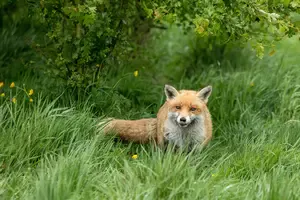
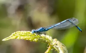
Dragonfly Pictures: Beautiful Close-Up Photos & How to Take Yours
Close-up dragonfly and damselfly images from UK nature walks — chasers, darters, hawkers and demoiselles. Where to find them, plus photography tips.
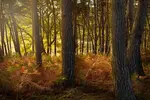
Low Light Wildlife Photography: Master Techniques and Gear
Low light wildlife photography tips: Capture stunning wildlife images between dusk and dawn with essential gear tips, optimal settings, and expert advice
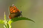
Getting Into Wildlife Photography: A Beginner's Guide
Camera settings, golden hour lighting, fieldcraft and composition for beginners. A nature photographer's guide with real examples from the field.


Copyright © 2018- naturewalkswithcarol.com All rights reserved
Home. | About Me | Contact Me | Blog | Privacy Policy